Ability to See Test Case Information Easier

Hello,

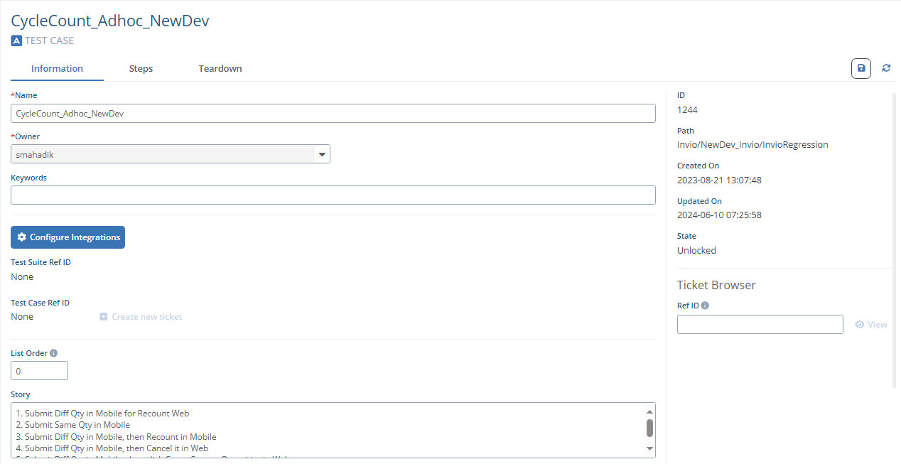
I would like to be able to see the Test Case information a bit easier without having to scroll down. It looks like the Story input field is set to 4 rows, it would be nice if this was set 8-10 and moved to the top of the screen. This will massively help us keep track with what our automations are supposed to be covering, and I want to begin implementing strong story/descriptions going forward as our massive automation development continues.


Current Layout:

Proposed Layout:

0
2 comments
Avatar
Joseph Hamdan

Hi Zach,

Thank you very much for taking the time to share your feature request with us. We truly appreciate your input and are always eager to hear suggestions that can help improve our platform.

Rest assured, we will carefully review your request and evaluate its feasibility. We understand how important this feature is to you, and our team will strive to provide an update as soon as we have more information.

Should you have any further questions or additional suggestions, please do not hesitate to reach out.

Regards,
Subject7 Team
1
Comment actions Permalink
Avatar
Zach Schwantes

Thank you Joseph!!

0
Comment actions Permalink

Please sign in to leave a comment.